06. Violin Plots
L4 061 Violin Plots 2 V3
Data Vis L4 C06 V2
Violin Plots
There are a few ways of plotting the relationship between one quantitative and one qualitative variable, that demonstrate the data at different levels of abstraction. The violin plot is on the lower level of abstraction. For each level of the categorical variable, a distribution of the values on the numeric variable is plotted. The distribution is plotted as a kernel density estimate, something like a smoothed histogram. There is an extra section at the end of the previous lesson that provides more insight into kernel density estimates.
Seaborn's violinplot() function can be used to create violin plots.
Example 1. Violin plot for plotting a Quantitative variable (fuel efficiency) versus Qualitative variable (vehicle class)
# Types of sedan cars
sedan_classes = ['Minicompact Cars', 'Subcompact Cars', 'Compact Cars', 'Midsize Cars', 'Large Cars']

# Returns the types for sedan_classes with the categories and orderedness
# Refer - https://pandas.pydata.org/pandas-docs/version/0.23.4/generated/pandas.api.types.CategoricalDtype.html
vclasses = pd.api.types.CategoricalDtype(ordered=True, categories=sedan_classes)

# Use pandas.astype() to convert the "VClass" column from a plain object type into an ordered categorical type
fuel_econ['VClass'] = fuel_econ['VClass'].astype(vclasses);

sb.violinplot(data=fuel_econ, x='VClass', y='comb');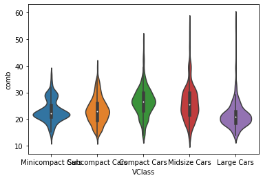
A violin plot with default arguments in violinplot() function
You can see that each level has been rendered in a different color, like how the plain countplot() was in the previous lesson. We can set the "color" parameter to make each curve the same color if it is not meaningful.
Inside each curve, there is a black shape with a white dot inside, a miniature box plot. A further discussion of box plots will be performed on the next page. If you'd like to remove the box plot, you can set the inner = None parameter in the violinplot call to simplify the look of the final visualization.
Example 2. Violin plot without datapoints in the violin interior
base_color = sb.color_palette()[0]

# The "inner" argument represents the datapoints in the violin interior.
# It can take any value from {“box”, “quartile”, “point”, “stick”, None}
# If "box", it draws a miniature boxplot.
sb.violinplot(data=fuel_econ, x='VClass', y='comb', color=base_color, innner=None)
plt.xticks(rotation=15);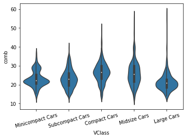
Additional Variation
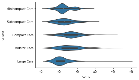
Much like how the bar chart could be rendered with horizontal bars, the violin plot can also be rendered horizontally. Seaborn is smart enough to make an appropriate inference on which orientation is requested, depending on whether "x" or "y" receives the categorical variable. But if both variables are numeric (e.g., one is discretely-valued) then the "orient" parameter can be used to specify the plot orientation.
sb.violinplot(data=fuel_econ, y='VClass', x='comb', color=base_color, innner=None);